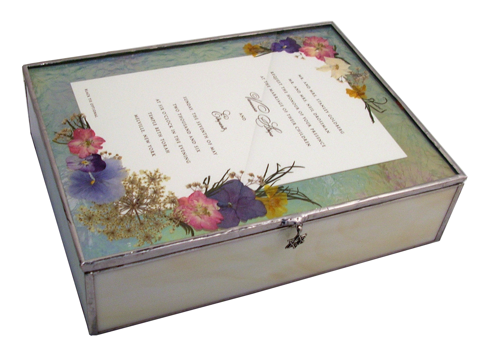
Here’s a stained glass Bat Mitzvah invitation box with a matching photo frame. I was originally asked by one person to make the box, then a few weeks later another customer asked for a box – for the same girl! So I suggested the photo frame. I don’t make them too often because they’re just as much work as the box (maybe more!) and so little of the actual invitation remains. But in cases like this, I think it works great. I did ask my first customer if she was okay with it before I proceeded as I didn’t want her to feel like her gift was lessened in any way. The second customer okayed it with the girl’s mom so we were good to go.
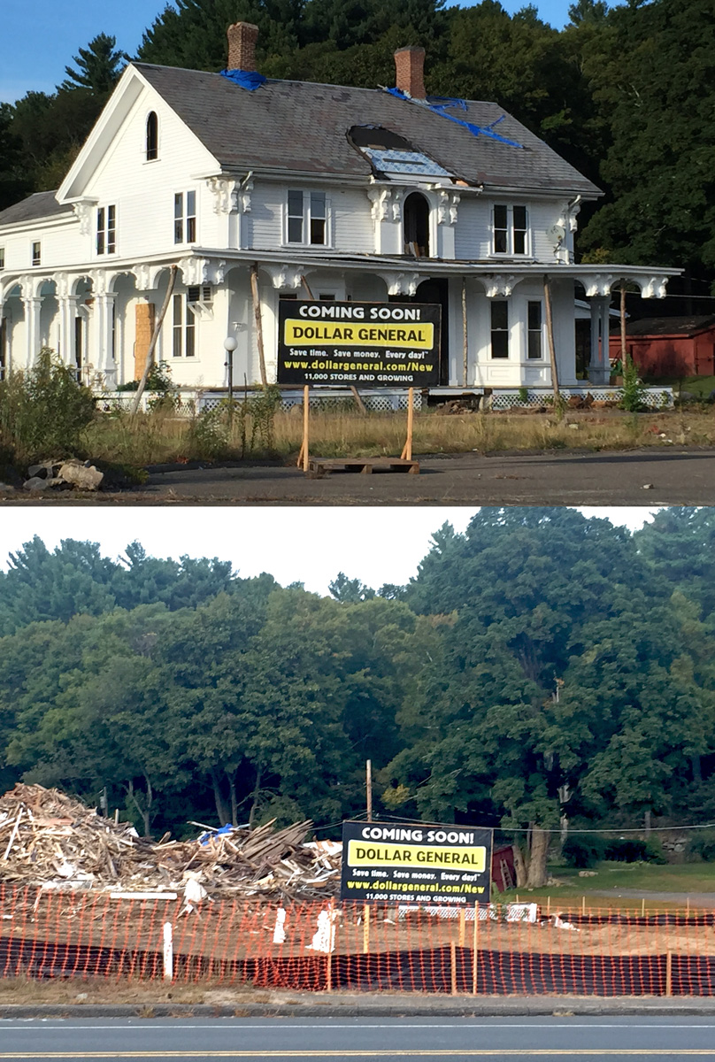
This beautiful Victorian/colonial house in Stafford, CT was demolished Monday morning. When I drove by in the morning it was standing, by the end of my workday it was a pile of rubble. I had known it was going to be torn down since winter and felt so sad over it. Such a gorgeous building, it deserved to be preserved and cherished by the town. I drive by every day on my way to work, musing about how nice it would be to have a fabulous bakery and tea room residing in it. Unfortunately I didn’t have the funds or really enough experience to make that work.
The colonial house had been built in 1816 by Parley Converse, one of the founders of the local wool mills. It received a Victorian renovation in 1870, then became a restaurant in 1930s, lasting up to recent times. The building was over 5,000 sq. ft. There had been efforts to save it, including a Facebook page but they failed.
It was in very good shape and had served upscale French cuisine. From the story I remember hearing, about ten years ago the owner would only sell it to someone who would renovate it. The listing read, “Turn key opportunity with a little elbow grease and paint….All equipment in place and inventoried…includes period moldings, ornate stairway and porches, 5 marble and 1 slate fireplace.” The new owner did fix it up, and rented it out as a restaurant again. My husband and I were so excited to go to the new Italian restaurant. We get there and were terribly disappointed! Whoever did their “decorating” should have been shot! They ripped out the ornate trim in the seating area and gave it all the personality of a Subway sandwich shop. Awful. In the hallway you could see some marble and a nice stairway, and the front parlour was intact, but only being used to store boxes. The food was okay, but not great. So sad. The restaurant didn’t last long but that wasn’t due to the economy. In fact another restaurant within walking distance was thriving – and even added on in recent years. Oddly enough that place has an ugly exterior but nice decor and the food is excellent.
According to what a friend overheard the owner was tired of trying to rent it out to places that couldn’t make a go of it and he felt it was the building’s features that inhibited his ability to find a viable tenant. So he decided to demo it and put up – a dollar store! When I told my boss what was about to happen, she was nonplused: she said, “That’s the town with the race track, right? They’ll be happier with the dollar store.” Grrr….perhaps she’s right. The townspeople didn’t put up enough of a fight to save it: people will move on, forget all about the beauty of their town, let people come in and replace it with ugly concrete and steel boxes…and cheap junk from China.
Here’s a simple but pretty wall hanging for an invitation. This one was for a wedding. It’s made with textured glass called Everglade. The swirls in the glass make it special. I used decorative brass corners plated in antiqued silver, which I added just a hint of gold powder onto. The frame uses a traditional picture framing “sawtooth” hanger. This way you don’t have an unsightly line showing through the clear glass!
It’s been such a long time since I’ve posted – truth is, I’ve been so busy this year that I couldn’t take on any additional work, so I didn’t want to encourage it. This past Spring and Fall I was helping out with the CT Renaissance Faire for their Robin Hood and King Henry Vlll shows, painting sets. Now that it’s winter I can take on more of my own projects. So here’s a box that I did this earlier this year with pressed flowers. It’s for a Bat Mitzvah but does show two names – two girls had theirs together. I love using textured glass for the sides, this pattern is called “Thistle” and comes in amber, blue or clear. I only press some of the flowers myself as I haven’t had time to get into too many varieties of ones that press well. My mom presses some, and the rest come from a woman in Washington State, except for the four-leaf clovers which I purchased online. Maybe it’s cheating to use GMO clovers – but they’re so cool!
A lot of people think of stained glass as being old fashioned or cute. I think that stained glass CAN have a contemporary look to it. Made with clean lines, minimal colors and less “fluff” (which I happen to like at times!), stained glass can have a modern feel. I’ve done these three boxes with clear or ivory glass, crystals and pearls. Elegant but not stuffy!
Today I finished this box with a scalloped copper foil edge. Somehow I always manage to get a copper “paper cut” from the scalloped foil! Oh well. This box was made for a dancer, using the playbill for the show. I made a copy of the inside page, as only half of it shows to the front. I then put it on the inside top lid. I made a scan of the original. Brought it into photoshop and cleaned it up to print onto the orange paper
Recently I’ve started to use real Swarovski crystal strands around the borders of the invitation, with a few charms. I think it looks really elegant. I solder the entire strand so it is solidly attached. This one is made with amethyst crystals. The box sides are a very pale purple color. It has a mirror bottom but I also made a purple pad for the bottom, which helps to bring out the purple of the glass.
When I send out a glass box I put them in an inner box and then an outer box. My customers sometimes give me a card to put in as well. So I offer gift wrapping for the inner box if I ship directly to the recipient.
Several people have asked about my invitation boxes with pressed flowers and I realized today that I don’t have any pictures of them here! The only item I have with real flowers is a shadow box made with dried flowers from the bridal bouquets, but they are three-dimensional, not pressed flat.
Some of the flowers I press myself, after all, I am a member of my local garden club! I press some purple and blue hydrangeas, violas, larkspur, delphinium and some greenery. Some flowers my mom presses for me, hydrangeas and Queen Ann’s lace, mostly. The more exotic ones come from Washington state, from a mom who home schools her children. I recently was able to purchase real 4-leaf clovers!
As for the invitations, usually they are arranged onto the invitation itself, or sometimes into the border. Here’s a few:
Where I currently work we have licensed rights to various universities and colleges. Recently we had to make a tough decision: do we keep UCONN or let it go? Since the company I work for is located in Connecticut, it would seem logical to keep the school’s licensing rights but they are restricting the new logo’s usage to a select few. So far, I’ve only seen that Nike and Duncan Donuts are allowed to use the new logo. If you look in the specs above, it says UConn will “announce it’s future marks and their availability to licensees” in early winter/spring. Of course, early winter/spring meant May 1st, a full two weeks after they revealed the logos to the general public. Just my opinion here, but doesn’t UConn value their licensees more than this – that they get this info after the public gets it? Then to see that unless you’re willing to cough up big bucks, you can’t have it until 2014! So that means for the small businesses, they don’t get a mascot logo from UConn for one year and a half! Since the company I work for makes items for women, the logo that was most popular was the mascot, not the lettering. So without the rights to use it, the best option was to cancel the license for now, and maybe pick it up again in the future. Too Bad.
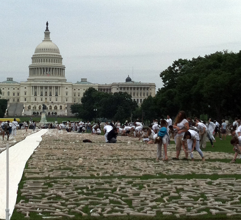
Recently I went with my husband to Washington D.C. to visit friends. We were on our way to the National Gallery of Art, primarily to see the Albrecht Dürer exhibit. We passed by the Mall and saw hundreds of people dressed in white running to piles of what looked to be bones, grabbing a handful and placing them on the lawn. Interested, we took a closer look. They were, of course, fake bones, made of recycled cardboard: egg carton-like material cast into a variety of bone shapes. From their website is a brief synopsis:
One Million Bones is a large-scale social arts practice, combining education, hands-on art making, and public installations to raise awareness of ongoing genocides and mass atrocities in places like Sudan, South Sudan, the Democratic Republic of the Congo, Somalia and Burma. For the past three years we have been collecting 1,000,000 handcrafted bones for a three-day installation event on the National Mall in Washington, D.C., June 8-10, 2013. The installation will exist as a collaborative site of conscience to honor victims and survivors, and will also serve as a visual petition against ongoing conflicts and a resounding call for much need and long overdue action.
We watched and read about the project and moved on. We saw the amazing Dürer exhibit and then went over to the west building to see the Edvard Munch show and then browsed around. One of the rooms had just 4 large paintings by Thomas Cole, The Voyage of Life. I found the scenery depicted was fabulous (though the angels were too much) and I loved how he handled the clouds. Steve was particularly struck by the series and asked me for my phone to photograph them. As we walked back toward where we parked we were just about at the bones again and I wondered how far they had gotten while we were inside. Steve was talking about the Cole series and saying how sometimes he doesn’t like the art for the imagery but more for the meaning. I was thrilled! This is what artists throughout time, all over the world have been trying to get across! Artists have used many forms of media to produce something that inspires and moves you emotionally. This clearly was what the One Million Bones project was all about. The chance to bring a message to the general public in a format that transmits the message in a powerful way.
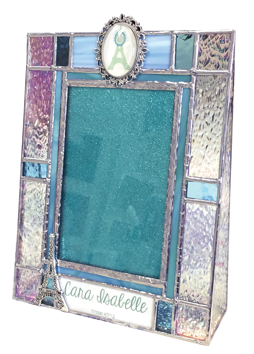
 Here’s a stained glass Bat Mitzvah invitation box with a matching photo frame. I was originally asked by one person to make the box, then a few weeks later another customer asked for a box – for the same girl! So I suggested the photo frame. I don’t make them too often because they’re just as much work as the box (maybe more!) and so little of the actual invitation remains. But in cases like this, I think it works great. I did ask my first customer if she was okay with it before I proceeded as I didn’t want her to feel like her gift was lessened in any way. The second customer okayed it with the girl’s mom so we were good to go.